WooCommerce Promotional Visuals Free vs Pro: What’s Included at Each Tier
Plugin Guide · Smart Cycle Discounts
WooCommerce Promotional Visuals: Free vs Pro
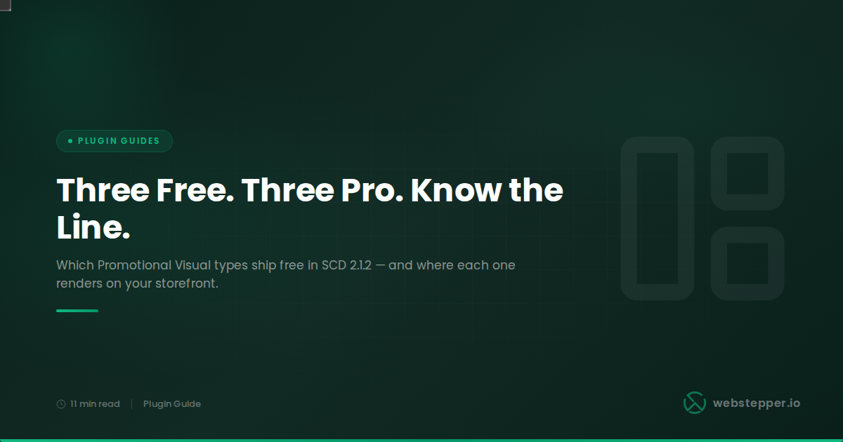
Smart Cycle Discounts 2.1.2 introduced Promotional Visuals — a live designer for sale graphics that attach directly to campaigns. Three visual types are included free; three require Pro. This post explains what each type looks like, where on the storefront it renders, and which tier it lives in — verified against the plugin code.
When Smart Cycle Discounts 2.1.2 shipped, it retired the old badge designer and replaced it with a new system called Promotional Visuals. The idea is straightforward: instead of a badge being a plugin-wide setting, each visual is a standalone design you build in a live designer and attach to individual campaigns. When the campaign is active, the storefront renders the visual wherever that campaign applies.
Six visual types exist in total. Three are available in the free version — image badges, summary badges, and BOGO panels. Three require Pro — tier panels, bundle panels, and the threshold bar. The split follows the same logic as the plugin’s discount-type split: the free types serve the discount mechanics available in free (percentage, fixed, BOGO); the Pro types serve the mechanics that require Pro (tiered quantity, bundle deals, spend threshold).
Everything below is verified against the current plugin code — specifically class-visual-types-registry.php (the single source of truth for the six types and their Pro feature gates) and class-wc-display-integration.php (the hooks that put each type on the storefront). Version: Smart Cycle Discounts 2.1.2.
This post covers the tier comparison. For setup and design guidance, see the companion post.
If you want a walkthrough of how to design and configure a visual inside the plugin — template gallery, brand colors, inspector fields, assigning a visual to a campaign — that is covered in the Promotional Visuals design guide (post 107). This post covers what each type does and which tier it belongs to.
What Promotional Visuals Are and How They Differ From the Old Badge Designer
Promotional Visuals in Smart Cycle Discounts is the system for attaching custom storefront sale graphics to individual campaigns. You build each visual in a live designer with a template gallery, brand color bindings, and real-time preview, then assign it to a campaign. When that campaign is active, its assigned visuals appear on the storefront wherever the campaign applies.
The previous badge designer (shipped in earlier versions) was retired in 2.1.2. All storefront sale graphics now go through the Visuals system. The main differences:
- Per-campaign, not per-store. The old designer applied a single badge style store-wide. The new system lets each campaign carry its own visual — so your Black Friday campaign can have a different badge style than your standard weekend sale.
- Reusable library. Each visual lives in a Visuals Library. You can create a design once and assign it to multiple campaigns, or duplicate it and make tweaks for a specific campaign.
- Multiple surface types. The old designer only handled product-image badges. The new system includes badges, savings rows in cart totals, and offer-explanation panels — three fundamentally different kinds of storefront communication, each with its own templates.
- No manual CSS required. Colors, typography, spacing, and shape are all controlled through the designer’s inspector. The plugin emits the styles inline; no custom CSS is needed for most configurations.
This post is also a natural companion to the full Smart Cycle Discounts free vs Pro breakdown, which covers every other feature area (discount types, scheduling, analytics, Cycle AI, etc.) but was written before Promotional Visuals shipped. The two posts together give you the complete picture.
How Visuals Render on the Storefront
Promotional Visuals in Smart Cycle Discounts render through WooCommerce’s existing hook system — action hooks and filter hooks — not through a separate frontend JavaScript layer. There is no extra script that re-queries your product data client-side. This matters for page speed and for compatibility: visuals render on the server along with everything else on the page.
Concretely: image badges hook into woocommerce_before_shop_loop_item_title (shop pages) and woocommerce_single_product_image_thumbnail_html (product pages). Summary badges and offer panels hook into the cart and checkout totals area. The threshold bar hooks into woocommerce_before_cart_totals and woocommerce_review_order_before_submit.
One thing visuals do not do: they do not make your products appear in WooCommerce’s native “On Sale” product filter or the wc_get_product_ids_on_sale() function. Smart Cycle Discounts applies discounts at render time through WooCommerce’s price filters, not by writing to the stored _sale_price database field. The storefront strikethrough pricing and “Sale!” flash badge render correctly — WooCommerce derives is_on_sale() from the filtered price at display time — but sale filter widgets that read stored sale data will not pick up SCD-discounted products. The dedicated post on the On Sale filter limitation explains the architecture behind this in full.
Each campaign can have multiple visuals assigned across different slots
A single campaign can carry an image badge (for the shop and product pages), a summary badge (for cart totals), and a panel or bar (for the offer explanation on the product page and cart). You assign visuals slot by slot — you are not forced to use all slots, and you can mix and match visual types across slots for the same campaign.
What “Discount-Type-Aware Picker” Means
When you assign a visual to a campaign in the wizard’s Promotional Visuals step, the picker shows you only the visual types that are compatible with that campaign’s discount type. This is what “discount-type-aware picker” refers to.
The logic is practical: a tier panel is only meaningful if the campaign runs a tiered quantity discount. There is no point showing it as an option for a percentage-off campaign. Similarly, a BOGO panel only makes sense for a BOGO or Buy X Get Y campaign. The threshold bar only applies to spend threshold campaigns.
In practice, the picker surfaces three slots — badge, panel, and bar — and shows tiles only for the types that fit:
- Badge slot — shows image badge (for shop/product pages) and summary badge (for cart/checkout). Available on every campaign regardless of discount type.
- Panel slot — shows the panel type that matches the campaign’s discount type: tier panel for tiered campaigns, BOGO panel for BOGO and Buy X Get Y campaigns, bundle panel for bundle campaigns. For percentage and fixed-amount campaigns, there is no compatible panel type — those discount mechanics do not have offer structure to explain beyond the headline number.
- Bar slot — shows the threshold bar only for spend threshold campaigns. No other discount type activates this slot.
This design prevents mismatched assignments and makes the picker easier to navigate — you only see what applies to the campaign in front of you.
Free: Image Badge
The image badge is a sale graphic overlaid on the product’s image. It is the most immediate visual signal that a product is discounted — visible at a glance on shop pages and product pages before a customer has read any text.
Where it appears: on the product image thumbnail on shop and category pages, and on the main product gallery image on single-product pages.
What it shows: the discount headline. Default text is the discount value (e.g., “20% OFF” or “Save $5.00”), but the text field supports custom copy and dynamic tokens. The {discount_value} token substitutes the campaign’s discount percentage or amount at render time. {savings_amount} substitutes the absolute currency saving on the specific product.
Templates (shapes): the designer ships four template recipes — Badge (rounded, configurable corner radius), Ribbon (notched flag-tail cutout), Starburst (spiky seal shape), and Circle stamp. All four are structural variants of the same image badge type. Any template’s colors, font size, and font weight are editable in the inspector after picking the recipe.
Storefront rendering: the badge HTML is output inside the image wrapper via the woocommerce_before_shop_loop_item_title action (shop loop) and the woocommerce_single_product_image_thumbnail_html filter (product gallery). No frontend JavaScript is required.
Tier: free.
Free: Summary Badge
The summary badge is a savings summary that appears in the cart totals and checkout review. Where the image badge is about catching attention on the browse pages, the summary badge is about confirming the saving at the moment the customer is committing to buy.
Where it appears: in the cart totals block (above the order total) and in the checkout review order section (above the submit button). This covers both the standard WooCommerce cart and checkout templates and the WooCommerce block cart and checkout.
What it shows: a summary of the discount applied to the order. The specific copy and format depend on the template chosen. Supports {discount_value} and {savings_amount} tokens.
Templates: four layouts — Highlighted row (a full-width totals row with a tinted background, visually matching the WooCommerce totals table structure), Inline pill (a compact accent chip inline with the totals label), Side note (italic marginal text), and Strikethrough (crossed-out amount alongside the discounted figure). The highlighted row is usually the most natural fit in a standard WooCommerce totals layout because it occupies the same visual space as the built-in subtotal and tax rows.
Storefront rendering: hooks into woocommerce_cart_totals_before_order_total and woocommerce_review_order_before_order_total.
Tier: free.
Free: BOGO Panel
The BOGO panel is an offer-explanation panel that communicates how a Buy One Get One or Buy X Get Y promotion works. Where an image badge can only show a headline, the panel can show the mechanics: buy two, get one; buy three, get one at 50% off; and so on.
Where it appears: on the product page above the Add to Cart button, and in the cart and checkout offer panels above the totals. This means the explanation follows the customer through the purchase journey — they see it when evaluating the product and again when reviewing their cart.
What it shows: the buy quantity, get quantity, and get-discount percentage for the campaign’s BOGO configuration. The panel renders these values dynamically from the campaign’s settings — you do not type them manually into the visual’s text fields. The three template layouts (Pill group, Featured, Card stack) present the same information in different visual structures.
Discount type compatibility: the BOGO panel is compatible with both the bogo discount type (same-product pool BOGO, available free) and the buy_x_get_y discount type (cross-product BOGO, Pro-only). The visual itself is free — the Pro-only distinction is whether the underlying discount type is available, not whether you can design the panel.
Storefront rendering: hooks into woocommerce_single_product_summary (product page, priority 25, just above the Add to Cart button area) and woocommerce_before_cart_totals / woocommerce_review_order_before_submit (cart and checkout).
Tier: free.
Why percentage and fixed-amount campaigns don’t have a panel type
Panels exist to explain discount mechanics that a single-line badge cannot communicate clearly. “20% OFF” tells you everything you need to know — no panel is necessary. A tiered discount, a BOGO deal, or a bundle requires structure to make sense. The panel slot only appears in the picker for campaigns whose discount type has structure to explain.
Pro: Tier Panel
The tier panel is a structured display of a tiered quantity discount’s price ladder. It shows every quantity tier configured in the campaign — minimum quantity, discount percentage or amount, and optionally the per-unit price or total savings at each tier — so customers can see the full volume pricing schedule before they add items to their cart.
Where it appears: on the product page above the Add to Cart button, and in the cart offer panels above the totals. The panel on the product page is particularly important for tiered discounts because customers need to know the tier structure before they decide how many units to buy.
What it shows: each tier row, the discount at that tier, and optionally the per-unit price and total savings columns. The active tier (the one the customer currently qualifies for based on cart quantity) is highlighted. A next-tier nudge is also available — it can show “Add 5 more to save 25%” when the customer is just below the next tier threshold. The tier data comes from the campaign’s configuration dynamically.
Templates: four layouts — Pills (inline horizontal tier chips), Cards (stacked individual cards per tier), Compact table (tight tabular grid), and Rows (vertical list). Each has sensible defaults for density and colors, all adjustable in the inspector.
Why it requires Pro: tiered quantity discounts are a Pro discount type in Smart Cycle Discounts. The tier panel visual gates with the same Pro requirement as the underlying discount type (discount_type_tiered feature gate). For more on how tiered pricing works, the tiered volume pricing documentation covers the tier configuration and checkout behavior.
Tier: Pro (requires tiered quantity discount type, which is also Pro).
Pro: Bundle Panel
The bundle panel displays the products included in a bundle deal campaign. A bundle discount is one where a customer receives a discount for buying a specific set of products together, and the panel’s job is to show which products are in the bundle and what the saving looks like.
Where it appears: on the product page above the Add to Cart button, and in the cart offer panels. On the product page, it makes the most sense on any product that is part of the bundle — seeing the other bundle products listed alongside the discount gives context that a simple badge cannot provide.
What it shows: the products in the bundle (with optional thumbnails), the bundle savings amount, and the overall bundle discount. The product data is drawn from the campaign’s bundle configuration; the panel renders it dynamically.
Templates: three layouts — Strip (a horizontal row of items that wraps on overflow), Carousel preview (horizontally scrollable thumbnails for larger bundles), and Stack (a vertical list with leading thumbnails). The stack layout works well for bundles with three or more products where the horizontal layouts would feel crowded.
Why it requires Pro: bundle deals are a Pro discount type in Smart Cycle Discounts. The bundle panel gates with the same Pro requirement as the underlying discount type (discount_type_bundle feature gate).
Tier: Pro (requires bundle deal discount type, which is also Pro).
Pro: Threshold Bar
The threshold bar is a progress bar that shows how close a customer is to unlocking a spend-threshold discount. Spend threshold campaigns apply a discount when the cart reaches a minimum value — “spend $75 to get 10% off.” The bar turns that abstract condition into a visible progress state: “You’re $19 away from saving 10%.”
Where it appears: above the cart totals section on the cart page, and above the submit button on the checkout page. This placement puts the bar exactly where the customer is most likely to consider adding another item to hit the threshold.
What it shows: the progress toward the threshold goal. Before the goal is reached, it shows the remaining amount needed and displays a configurable pre-goal message — “Spend {remaining} more to save {discount_value}” is the default. After the goal is reached, it switches to a post-goal message — “You’ve unlocked {discount_value} off!” Both message texts are configurable in the inspector. For campaigns with multiple spend tiers, the bar tracks progress toward the next unlocked tier.
Templates: three layout variants — Smooth (a continuous fill bar), Segmented (the fill split into equal blocks), and Stepped (a track with 25%, 50%, 75% tick marks). Track thickness is an independent control (thin, medium, thick) on any layout.
Why it requires Pro: spend threshold discounts are a Pro discount type in Smart Cycle Discounts. The threshold bar gates with the same Pro requirement (discount_type_spend_threshold feature gate).
Tier: Pro (requires spend threshold discount type, which is also Pro).
The bar solves a specific friction point
Spend threshold discounts work well when customers can see how close they are. “Spend $75 to save 10%” presented as static text in a sidebar widget is easy to miss or forget by the time checkout arrives. A progress bar that updates as the cart total changes — sitting right above the totals the customer is already looking at — makes the incentive visible at the right moment. The threshold bar exists to solve that specific problem.
Full Feature Table
| Visual type | Free | Pro | Where it appears | Discount types |
|---|---|---|---|---|
| Image badge | ✓ | ✓ | Shop page (product thumbnail), product page (gallery image) | All campaigns |
| Summary badge | ✓ | ✓ | Cart totals, checkout review totals | All campaigns |
| BOGO panel | ✓ | ✓ | Product page (above Add to Cart), cart and checkout offer panels | BOGO, Buy X Get Y |
| Tier panel | ✗ | ✓ | Product page (above Add to Cart), cart and checkout offer panels | Tiered quantity (Pro) |
| Bundle panel | ✗ | ✓ | Product page (above Add to Cart), cart and checkout offer panels | Bundle deal (Pro) |
| Threshold bar | ✗ | ✓ | Cart totals area, checkout (above submit button) | Spend threshold (Pro) |
Templates by type
| Visual type | Shipped templates (recipes) |
|---|---|
| Image badge | Badge, Ribbon, Starburst, Circle stamp |
| Summary badge | Highlighted row, Inline pill, Side note, Strikethrough |
| BOGO panel | Pill group, Featured, Card stack |
| Tier panel | Pills, Cards, Compact table, Rows |
| Bundle panel | Strip, Carousel preview, Stack |
| Threshold bar | Smooth, Segmented, Stepped |
Key Takeaways
- Promotional Visuals shipped in Smart Cycle Discounts 2.1.2 as a replacement for the legacy badge designer. All storefront sale graphics now go through the new system.
- Three types are free: the image badge (overlaid on product images on shop and product pages), the summary badge (savings summary in cart and checkout totals), and the BOGO panel (offer explanation on the product page and cart for BOGO and Buy X Get Y campaigns).
- Three types require Pro: the tier panel (tiered quantity price ladder), the bundle panel (bundle deal product list with savings), and the threshold bar (spend progress bar above cart and checkout totals). Each Pro visual type gates with the same Pro feature as its corresponding discount type.
- The discount-type-aware picker in the campaign wizard shows only the visual types that are compatible with the campaign’s discount type — tier panels only appear for tiered campaigns, the threshold bar only appears for spend threshold campaigns, and so on.
- All visuals render through WooCommerce’s hook system — no extra frontend JavaScript. Image badges use product image hooks; summary badges and panels use cart and checkout hooks; the threshold bar uses the cart totals hook.
- If you run percentage-off or fixed-amount campaigns, the free image badge and summary badge cover your main storefront communication needs. The BOGO panel adds meaningful value if you run BOGO promotions. Pro visuals matter most for stores running volume pricing, bundle deals, or cart-threshold incentives.
Common Questions Answered Directly
Do I need Pro to use sale badges on my shop page?
No. The image badge — which overlays a sale graphic on your product images on shop and category pages — is included in the free version of Smart Cycle Discounts. You can design it with the live designer (choosing from Badge, Ribbon, Starburst, or Circle stamp templates), configure colors and text, and it renders on the storefront automatically when the campaign is active.
What does the threshold bar actually look like to a customer?
The threshold bar appears above your cart totals as a horizontal progress bar with a message. Before the goal is reached, it shows something like “Spend $19.00 more to save 10%” — the exact copy is configurable. The bar fills as the cart total increases. Once the customer hits the threshold, the message switches to the post-goal text you configured (something like “You’ve unlocked 10% off!”). It updates as customers change cart quantities. This is a Pro feature because spend threshold discounts are Pro.
Can I use a BOGO panel on a Buy X Get Y campaign, or only on same-product BOGO?
The BOGO panel supports both. It is compatible with the bogo discount type (same-product pool buy/get, which is free) and the buy_x_get_y discount type (cross-product BOGO, which requires Pro). The visual itself is free — it is the Buy X Get Y discount type that is Pro, not the panel design. So if you have Pro and run a Buy X Get Y campaign, the BOGO panel will be offered in the picker.
Can I use the same visual design on multiple campaigns?
Yes. Visuals live in a library separate from campaigns. Once you design a visual, you can assign it to as many campaigns as you want. If you want a slightly different version for a specific campaign, you can duplicate the visual and tweak the copy — the duplicate becomes its own library entry and can be independently edited without affecting the original.
Do Promotional Visuals slow down my shop pages?
Promotional Visuals in Smart Cycle Discounts render through WooCommerce’s existing PHP hook system, not through a dedicated frontend JavaScript layer. The HTML is generated on the server as part of the normal page render. There is no extra script that queries your products or campaigns client-side. Whether any performance effect is noticeable depends on your server and caching configuration, but the architecture avoids adding a separate JavaScript-driven rendering layer to your storefront.
What happened to the old badge designer?
The legacy badge designer was retired in Smart Cycle Discounts 2.1.2. All storefront sale graphics now go through the Promotional Visuals system. The new designer gives you more control — live preview, brand color bindings, multiple templates, per-campaign assignment — than the previous system did.
How does the summary badge differ from the theme’s built-in “Sale!” badge?
WooCommerce themes typically show a “Sale!” flash badge on product images when a product is on sale. That badge is generated by WooCommerce’s woocommerce_sale_flash filter and appears on shop and product pages. The Smart Cycle Discounts summary badge is a different element — it appears in the cart totals area, not on product images, and shows savings information rather than a generic “Sale!” label. Both can coexist: the theme’s sale flash shows on browse pages, and the summary badge provides savings context in the cart. Smart Cycle Discounts also includes an option to suppress the theme’s sale flash if you prefer to control that display entirely through the image badge.
Promotional Visuals are in the free version — try them now
Install Smart Cycle Discounts free, create a campaign, and design an image badge or summary badge for it in the Visuals Library. No Pro upgrade needed to get started with storefront sale graphics.
